Philosophy
The design philosophy behind fuyukaki-ui and the ideas that drive it.
Warm & Organic
"Digital interfaces that feel like soil and wood, not cold metal and glass."
fuyukaki-ui follows a unique "No Black, No Gray" design philosophy. Instead of sterile grays and harsh blacks, we use warm earth tones inspired by nature.
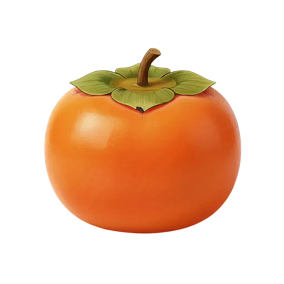
Color Palette
Persimmon (柿色)
#EB6101Our vibrant primary color
Leaf Green (葉色)
#6A8347Natural green for positive actions
Shibu Brown (渋色)
#4E3D35Warm brown replaces pure black for text
Off White (生成り)
#FAF7F2Paper-like background instead of stark white
Pale Orange (淡柿)
#FCEDE6Gentle surface color
This creates interfaces that are easier on the eyes, feel more human, and stand out from the sea of monochrome UIs.
Who is this for?
Food & Culinary
Restaurants, cafes, recipe sites
Lifestyle & Wellness
Organic products, yoga, meditation
Japanese & Traditional
Cultural sites, crafts, hospitality
D2C & Artisan Brands
Handmade goods, natural products
Features
Warm Color Palette
No pure black or gray, only natural earth tones
TypeScript
Full type safety and IntelliSense support
Accessible
WAI-ARIA compliant components
Tree-shakeable
Import only what you need